Post-editing of photos is a very hot topic among photographers. Many images that are shared via Instagram no longer reflect reality – they are either changed by the company’s own Instagram filters or by external tools. That is perfectly fine, I think, because I am also using these methods. But I look at this in a very differentiated way: when photos by me are used for press work, I do not need any post-processing at all which is by the way an absolute obligation for many publishers! Here it is extremely important that photos are not manipulated or misrepresented (theme fake news). For publication in glossy magazines, be it for nature and travel reports or people, these restrictions are not so strict. Especially with the very popular Instagram travel pages of various blonde beauties standing with flip-flops on an active volcano and can be photographed, filters are used excessively to get a uniform scheme of the images. I have also been asked from time to time how to create such an effect, a continuity, and I have to say that every one of my pictures gets a different look.
With this article, I would like to give you a little insight so that you can create your own filters to use them for your photos. You should have Adobe Lightroom and have your photos taken in RAW format. JPG works for some parts too, but it is not really suitable for post-processing, it is a final format and does not contain any additional information. You should of course have some previous knowledge in order to use Lightroom such as e. g. How do I import photos? How do I mark photos? etc.
Let’s go!
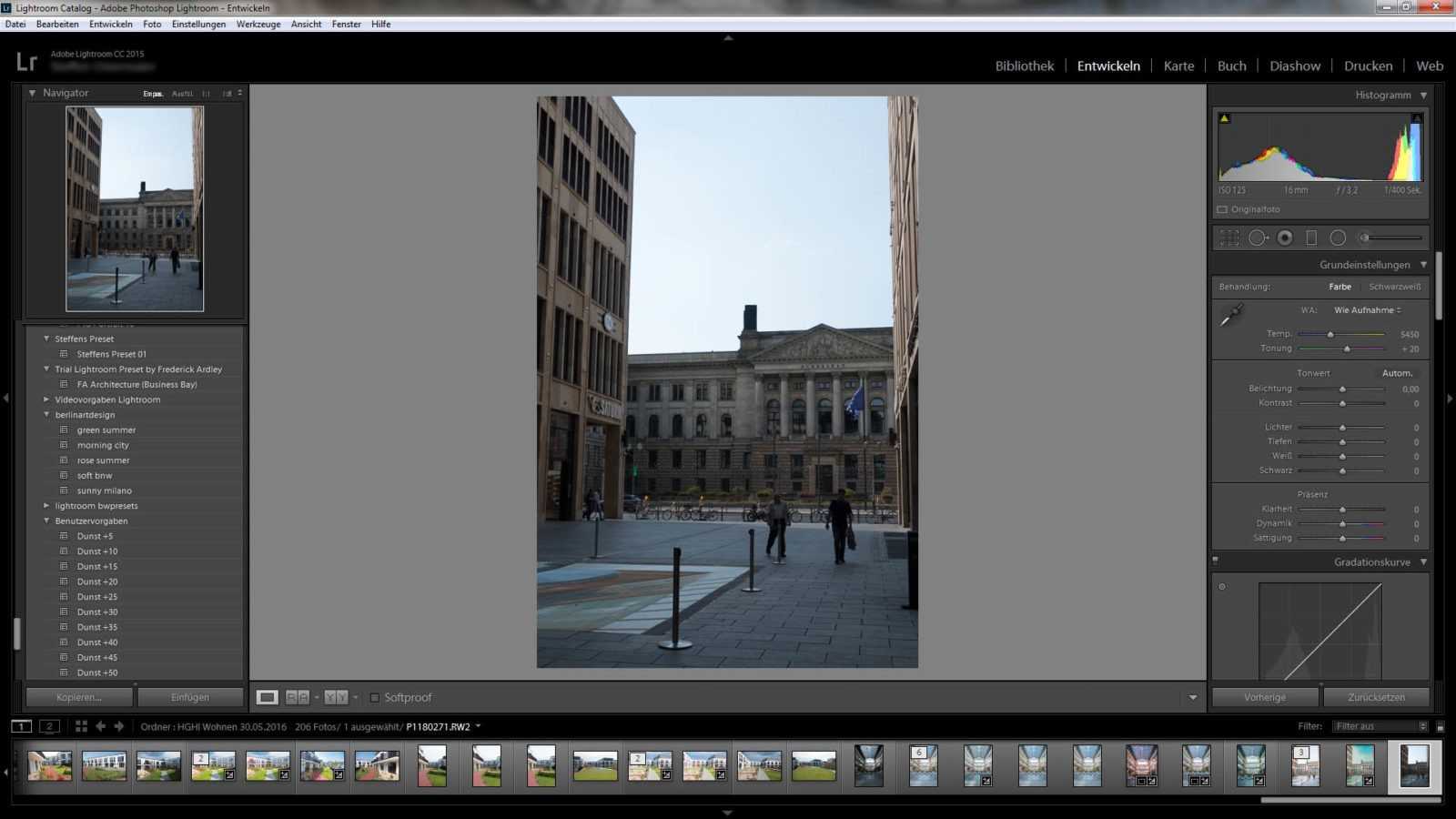
Editing images is handled via the “Develop” tab as in this example:
A completely pure picture without any adjustments, as you can see very well on the spongy colors and the wrong perspective. With the picture, I could have made sure that it looks halfway decent, but it’s perfect to demonstrate the changes.
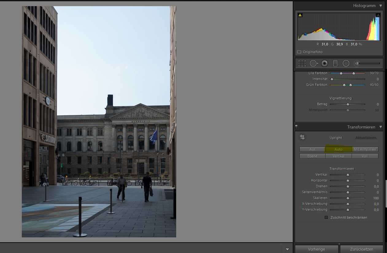
To the right of the picture, you will find several palettes with sliders for customization. The first one with the name “Default setting” is the most important one to optimize the picture. Since the photo is still tilting quite a bit, the palette “Transform” is also very important to correct the perspective. A click on “Auto” (marked in yellow) will show you the correct angle as shown in the following picture.
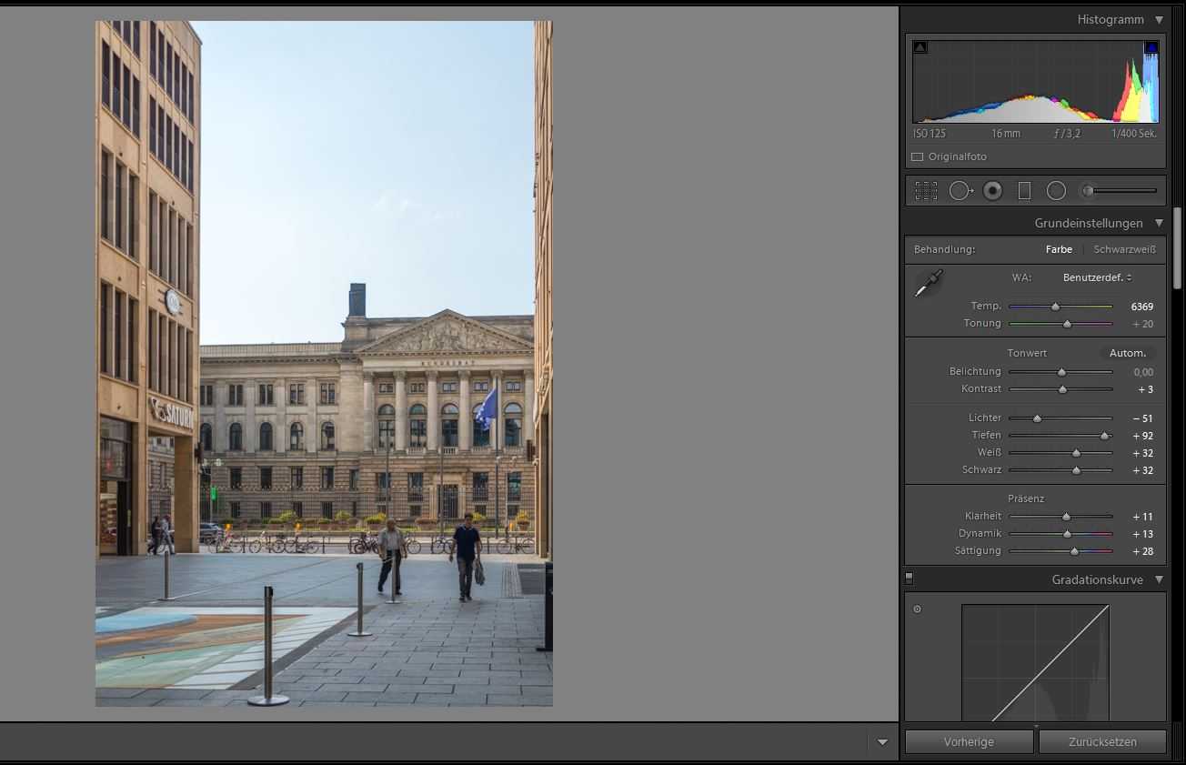
Adjustments can of course be done manually, the automatic system works quite well with this picture, no lines that fall over can be seen. We scroll back up to the basic settings and make sure we get the right color dress. On the picture: The lights (sky) are a bit too strong, but the depths are simply too dark. There is a lack of coloured pepp.
This looks a lot better already. It is still not perfect, but it’s a good start.
What have I done?
Since the picture was taken on a summer morning, I pulled the temperature control knob into the yellowish one. This makes the picture look a bit warmer. In order to highlight the blue in the sky a bit more, you can easily move the “Lights”control to the minus range, thereby light areas are attenuated and the blue of the sky appears. The dark areas, i. e. the depths and black, can be dragged smoothly into the plus area. You should be careful here. The dark areas contain less color information and noise can occur quickly. In our case this works fine, there is enough information and the noise reduction works quite well. For pictures taken with a high ISO value, this can also go into your pants. The “White” slider ensures that all areas are lightened up slightly and the overall picture looks friendlier.
To enhance or attenuate the contours, the slider is a useful tool for clarity. Practical also for portrait pictures to make e. g. faces a little softer. Dynamic and Saturation sliders for more color.
We have thus created a good basis for making further adjustments.
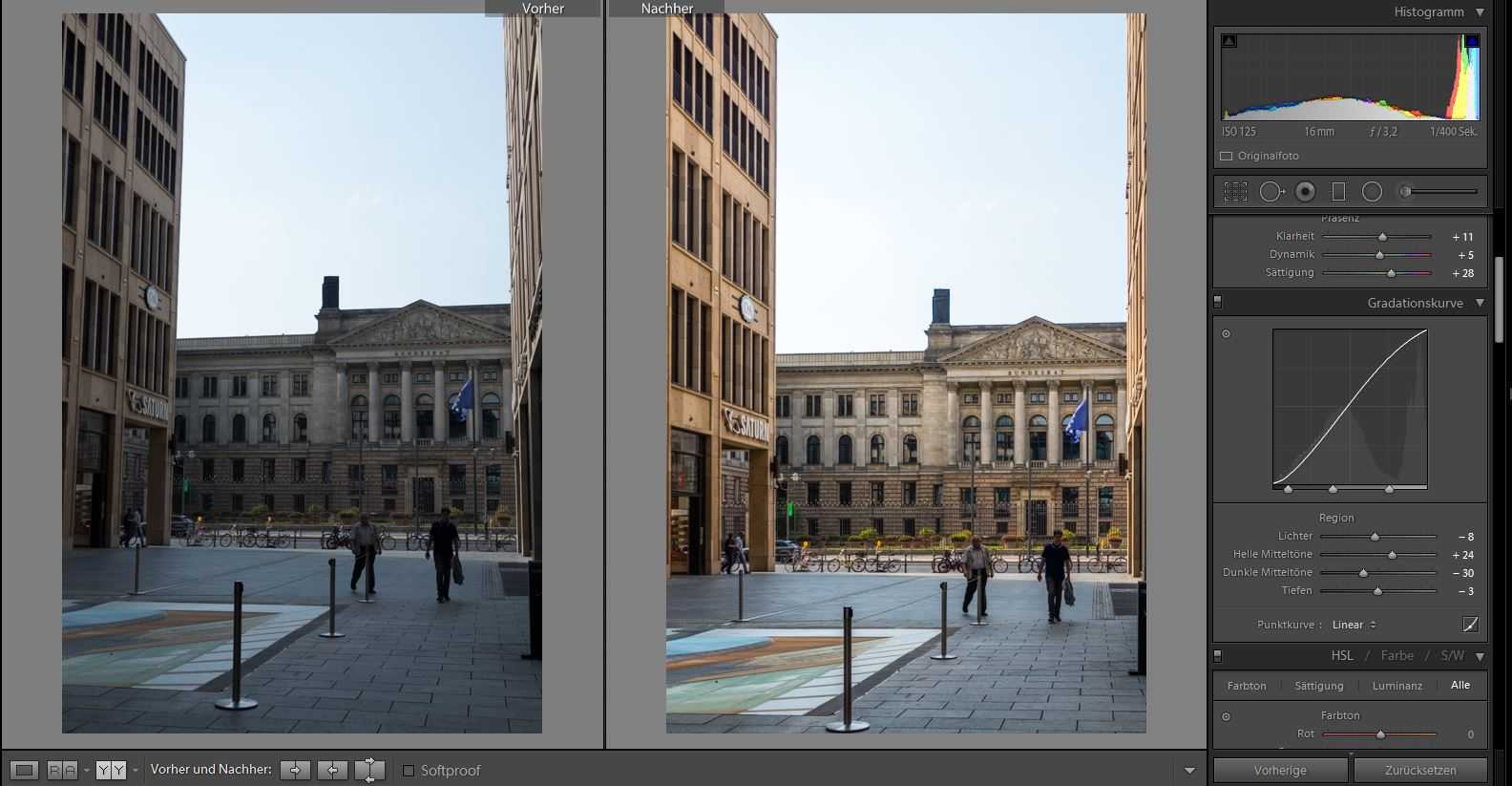
Another very useful palette is the “gradation curve”. Here you can make some adjustments in detail to e. g. light up colored areas from too flat or uniformly. In the comparison, you can see our changes very clearly.
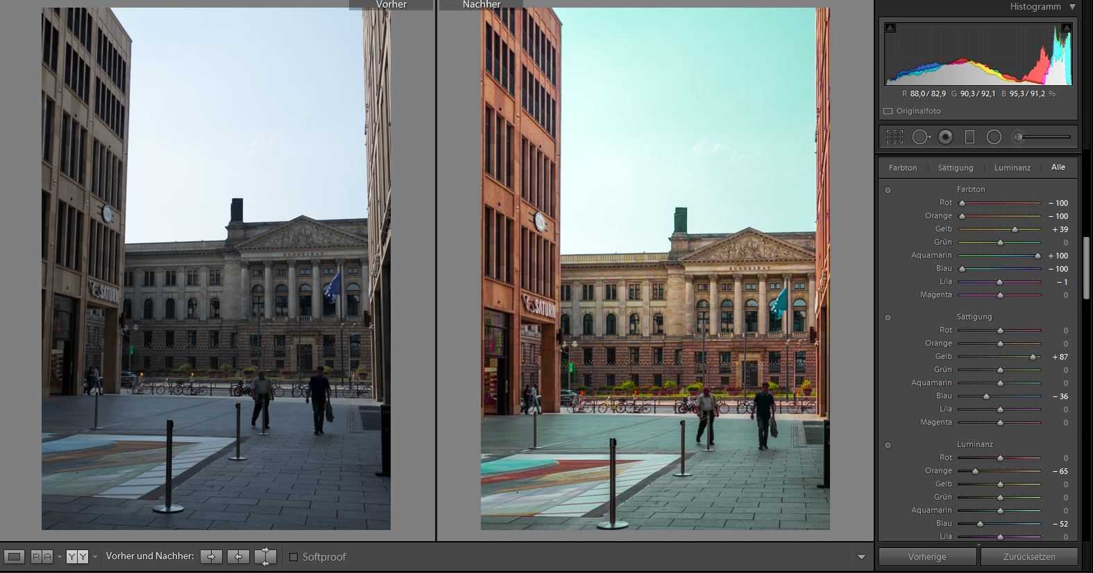
In order to manipulate colours or manipulate the overall picture, there are two different palettes among others the “HSL, colour, b/w” and the partial tone. With the first one, you can change specific colors, let’s assume that the blue tone in the picture is too strong, then you can scale it down with the saturation control at the corresponding color. So in our example you can change the complete color composition as shown in the following example with some exaggeration to clarify this:
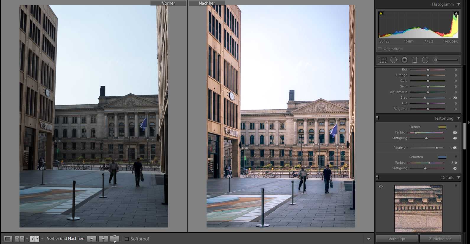
The Partial Tone toolbar allows you to adjust the color of your image smoothly, for example to achieve a certain mood. Especially with black and white images you can create very interesting effects. I really like to use this tool, but it requires a bit of finesse to produce the desired effect. For the sample image, I have adapted some small things to all other values, but nothing spectacular. The result looks like this, with a little bit of testing:
For my example, this is exactly the effect I wanted to produce. Further adjustments would be sharpness and noise reduction. With Lightroom you can do a lot more with them, but that would be too much for now.
Saving your own filter
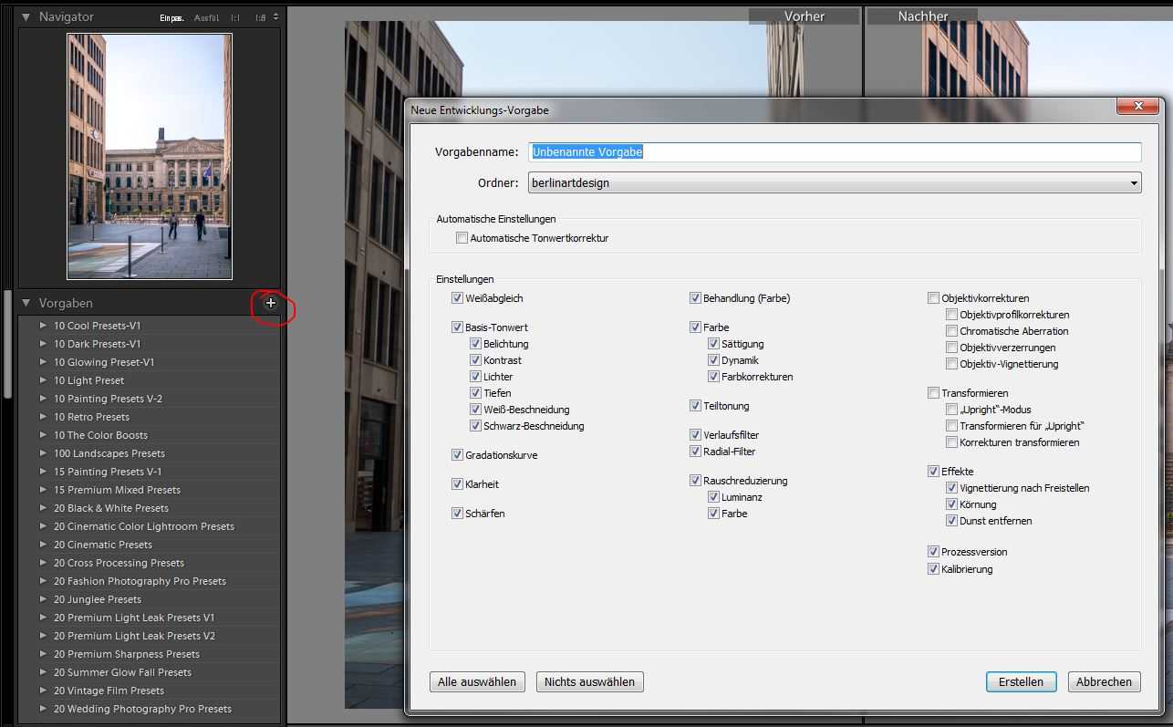
The last thing to mention is how to save the “Selfmade Filter” for further use with other images. On the left side you will find the drop-down box “Preferences” and a plus symbol (red mark in the picture) next to the name. In the dialogue you can now define which values you want to save. The transformation is less useful:
Now it’s up to you to create your own great filters. If you have any further questions or suggestions, just write me a comment 😁
Here are a few more comparisons of pictures that have been pepped up with Lightroom.
[twenty20 img1=”440″ img2=”441″ offset=”0.5″] [twenty20 img1=”444″ img2=”443″ offset=”0.5″] [twenty20 img1=”448″ img2=”447″ offset=”0.5″]
